The theme I have been working on for the last few months on an off is finally live. I was really pushing it over the last week to get it finished. With college work piling up I wanted to complete the design so I could focus more on college.
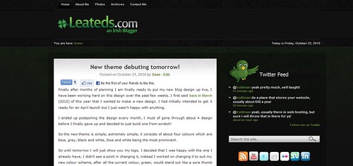
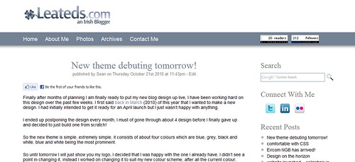
So if you have been on my blog before you will immediately notice the difference, first off its WHITE! Last time is was all dull and dark black and green, now though it is like it has been completed inverted and is now a simple two tone colour of blue and white which I really like. In case you forget, below is a picture of how it used to look and how it now looks!
Since this is my blog there was a few things I wanted to change, and since I spend a lot of time on the site I thought it was important to have it nice and bright and easy on the easy, not dark! So that was the first change I implemented into the design. The next thing I wanted was to widen the area where my blog posts display, it has always been too squashed and if I write a long blog post it would carry down the page forever! Now though it has plenty of room at 715px wide just for the blog posts, the total blog width is now 1024px.
I have now got live stats of my twitter and RSS followers, the RSS followers is a bit low but sure I don’t really care, it’s just a number. As you can see I have kept my old logo as I mentioned in yesterdays post, I was really happy with it so why change it!
Last night I took my site down offline around 1.30 am and started working on setting up my clean install of wordpress, I wanted to start fresh with this design so I had a lot of backing up to do with plugins etc. I ran into a few problems with my new database but I got that sorted after a short while.
I ended up having everything up and running again by 3.00 am and it was taken back out of maintenance mode. I still have a lot of tweaks to make in relation to other plugins I need and I also have a problem with the CSS of my bloggers list that usually is in my sidebar, but when I added the theme to this blog it suddenly broke its style I set it and I didn’t have time last night to fix it, the bloggers box is working perfectly on my test domain!
A few other things I added which I think are noteworthy are that I have upgraded my search engine on my blog, I am now using Google custom search engine to power my results, it is a lot better than the default wordpress one and it also has the added benefit of not making my server & database work to hard as the search queries are run through Google servers :D!
another change I added is under the title of every blog post I make from now on and in the past, it now show the exact date and time I publish my blog post, this is useful as I have a personal rule where if I do not have the blog post up by midnight, first off I have failed and secondly I just won’t put it up if it goes after that time.
So those are the major changes that I have made, I will go into my views on designing wordpress themes from scratch in another post some other day, possibly next week. So hopefully you like the new design too, if you have anything then feel free to let me know in the comments (which I built 🙂 took ages!).


2 Comments