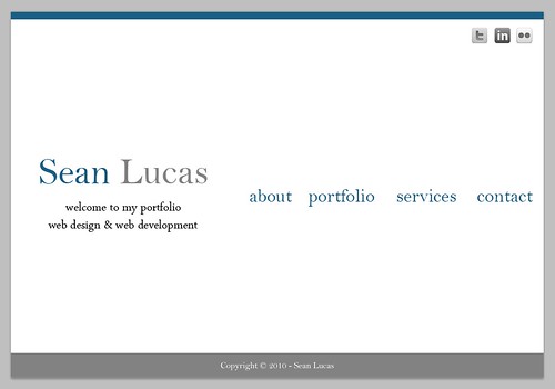
Like I said in my last blog post, I have been putting web design on the shelf over my last semester. But since getting the flare back after creating my Christmas design here on my blog I thought I would have another go at a bit of web design.
This time I am working on a design for my portfolio, I want this site to not only showcase some of my previous works, but also to provide a place where people can contact me for some web design.
I have really got into the simplistic look for websites as of lately, less is more! Like this blog, one main colour and it has a big impact, or at least I think it does 😉 So with this in mind I set out to come up with my portfolio design.
It is always a long process of deciding how exactly you want to make it look, do I want the navigation links on the top? bottom? or middle? the decision is difficult at times and easy on other occasions. This time it took me a while to settle with my decision, I have finally decided to have them in the middle.
Here is a look at how the design looks at the moment (click for a bigger version!), I have ideas on how I will get the pages to appear, so the links will have some movement when pages are shown.
I think I might use the design for my business cards that I want to get made. So for now the design is just a design, I have yet to make any code for it, but I think I am happy with it so the next step is just to code it, I will get this done over the Christmas break, it’s unlikely I will before then because of my college exams.

