I have been working on my new look for this blog for some time now, a few weeks back i put a rougher version of this theme live, just to see how it looked with all my pages and widgets in the sidebar. It wasn’t working the way i liked and i had a few issues with some plugins that wouldn’t work with the new theme.
Since i was having so many issues from the new theme i put back up my old one just while i made some tweaks to the new theme. I have another website set up where i test my new themes i am working on, so that was the environment i used to make the changes that were needed.
The new design for my blog is not one i made myself, instead i decided to buy one from ThemeForest, i wanted to have a pre-made template which i could modify to the way i needed it to be. The theme i bought was $35 and is called Presenter WP. It is a really nice theme and is mainly aimed towards business site. I bought it for its simple look and also for some of the features which it has that enhances how posts look such as bullet points etc.
A nice feature which it has built in is a portfolio section. I have yet to include a portfolio on this blog, i do already have a portfolio with some of my work in it, but it is an entirely different site than my blog, i had thrown a link into my nav bar above to that site, but i have since removed it because it was external. I feel that all my links in my navigation bar should be internal only! I have wanted to get my portfolio better integrated into my blog for a while now and i will be working on this over the coming weeks.
A huge change, at least in my opinion, that i have made to my blog is the change in colour and logo. My blog originally had a dark look to it when i first started, it was a grim looking black with my green logo, i then changed it to a very naked looking blog with a lot of white, a simple blue bar and a blue version of the original blue logo.
With this new blog design i have changed things up a lot, and i feel it looks better. There is still the easy on the eyes look to the te, the main content area is white and the text font looks good. The main change to the design side is the light blue background i have added into the site, its not too dark or bright that it distracts you from what i want people to look at, the content!
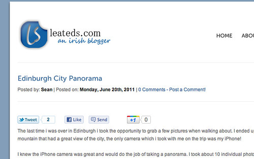
The other big change which i have made to the design is my logo. For a few years i have always used my original logo which i had made for me a few years ago, it was used in all my blog designs since i started blogging! The orignal logo can be seen below.
I always liked this logo, but after going through so many changes here on my blog i feel it has become a little outdated and i wanted to make a fresh new logo that would compliment my new blog design. Since this first logo i have come from not knowing how to use photoshop at all to now where i can understand everything i need and i have the ability to find out how to do what i want if need be. That was the main reason i originally bought the logo above, simply because i didnt know how to use photoshop!
Now though i refuse to pay for a logo, the logo is something that really ties a site together, and is sometimes the only image on a site, so it is important it looks how you want it. I spent hours in photoshop trying to come up with a new logo, i made dozens of new logos, but none that i felt would fit this blog. Finally i ended up with the new logo which i have live now!
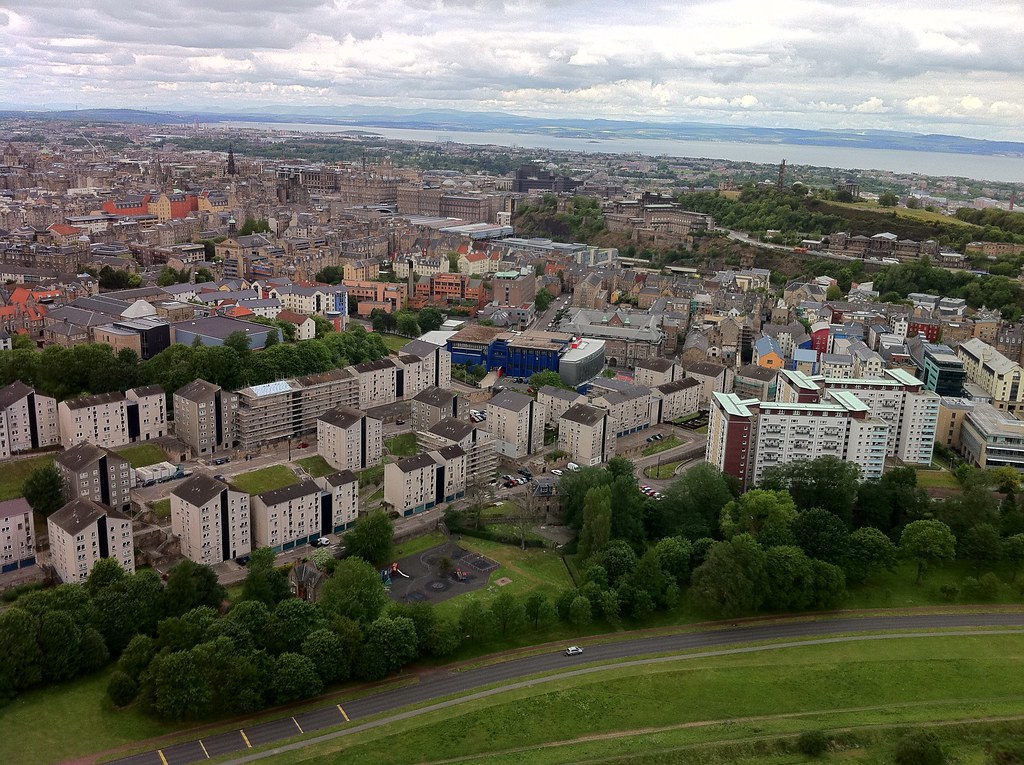
I also changed how my photos are displayed form flickr on this site, they used to show all my albums, but now they show a continuous stream of all my images, straight from flickr just like they would appear on flickr if you were looking at my photostream, they also have a nice lightbox effect. I still have a few more changes to make to my blog. I still need to get my search box back into the sidebar and i want to get the links for seeing more blog posts on the front page working again.

