Over the last few weeks Google have been updating everything! All their websites from Google, to Maps to their new social network Google+ & the new look Gmail, everything has changed and i was wondering if they would touch YouTube. Today i saw that Google have been working on a huge overhaul for YouTube and from what i have seen so far, its a great update.
The new update is code-named ‘CosmicPanda’, i have had a quick look at the main new features which come with this next update to YouTube. There are 3 main parts that i would use with the new update and they have introduced huge GUI changes. The sections which have changed the most are user profiles, the video page where you actually watch the videos and then they have also updated playlists slightly.
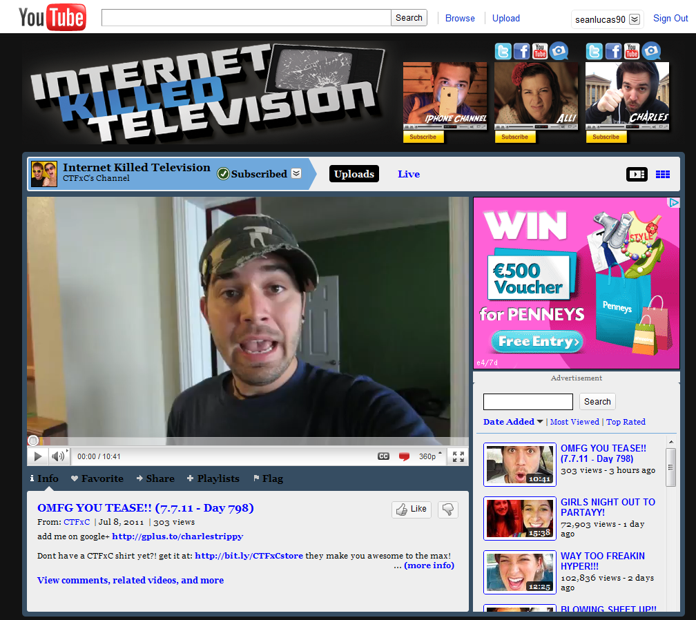
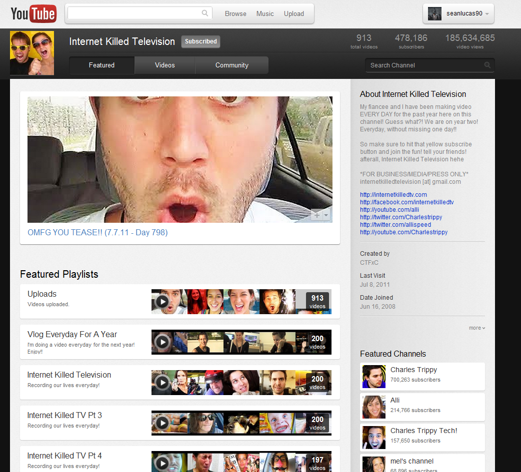
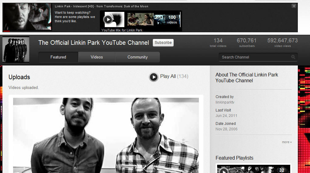
Each user as you know have their own channel, if you are a partner with YouTube you are allowed to change the default thumbnail of each video to any image you like, with the new update to the channels it takes advantage of these pictures, the channel page shows the latest videos uploaded just by displaying the thumbnails of the videos. There are a few different options you can have for your page now, one is to simply show all the video thumbnails, another is to show a list of you playlists. Below is how the old YouTube channels look with the new version below it (click them to see a bigger version!)
A huge difference as you can see, but looking through other YouTube channels will give you a better feel of the other options that are now available to YouTube users! If you haven’t already noticed, Google have also updated the navigation bar, its much more simple looking.
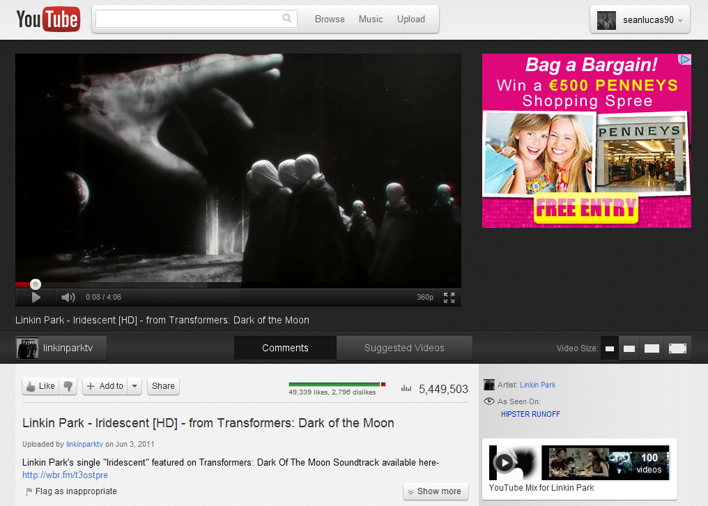
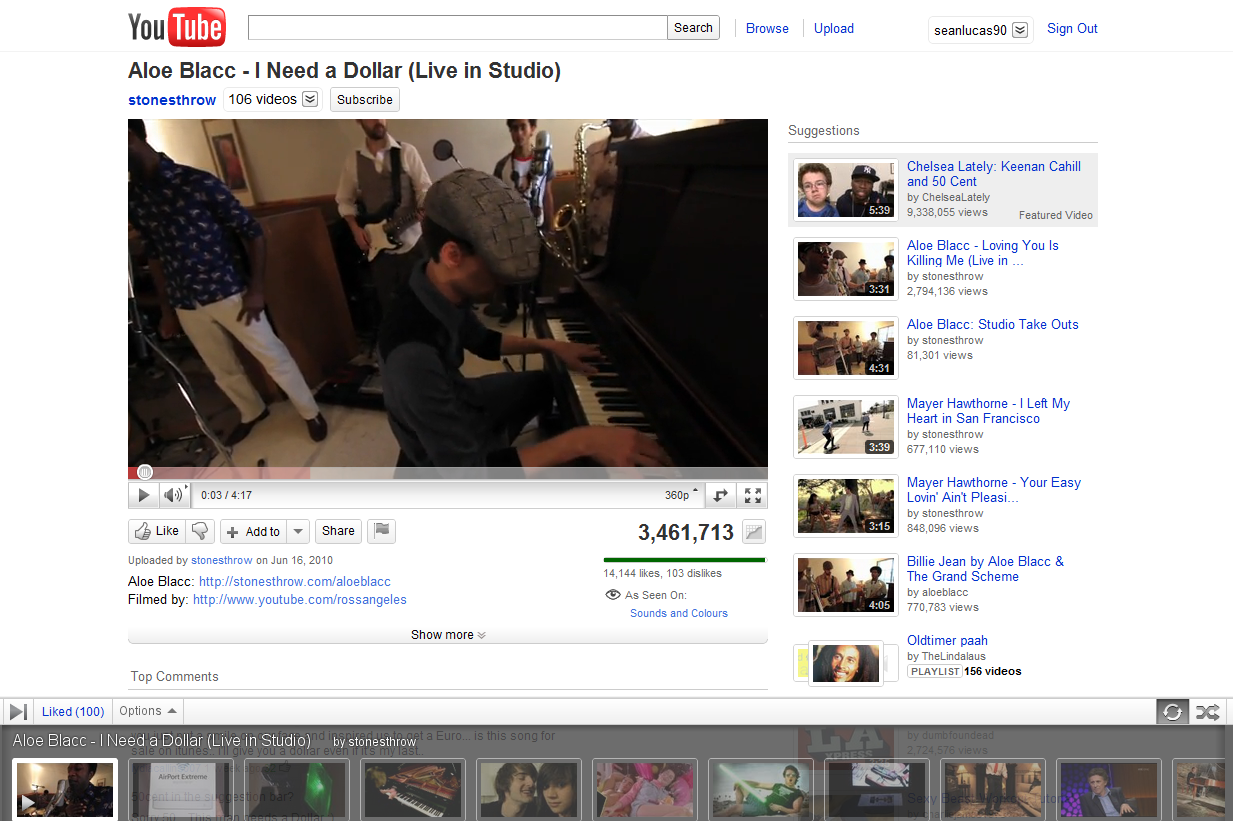
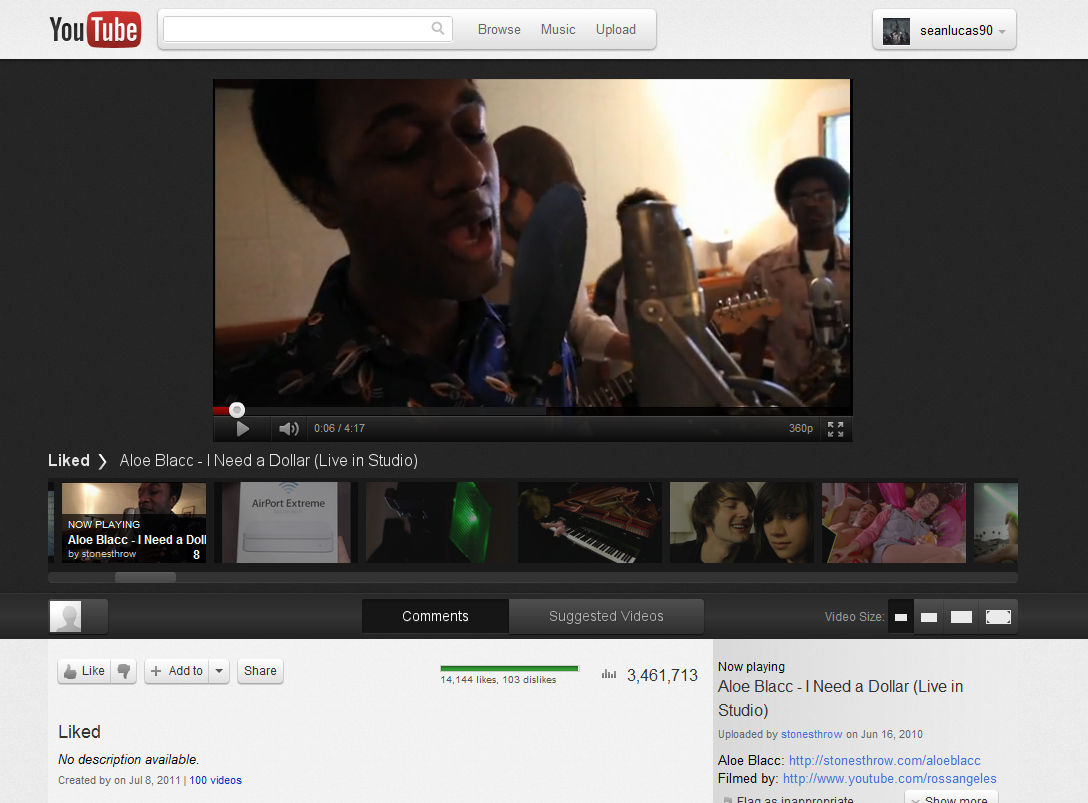
The page itself where you watch all your videos has been given a big update. The video player bar is now black along with a large black strip going the full width of the screen behind the video, the black strip works on the same principle of the ‘turn the light off’ feature a lot of sites use, it makes you focus more on the content they want you to, such as the video. The related videos to the right of the page have also been changed to a list of related thumbnails. Images old and new below! (click them to see a bigger version!)
The third big change that has been made to the site is a feature of the video play page too, it is the playlist feature. Instead of having an annoying video strip along the bottom of your screen as a pop up, it has now been change to a video strip below the video. Images below old and new (click them to see a bigger version!)
I really like the changes that have been made. Another great thing that you can now do is when you are watching a video, you can click into your account page or go onto the channel of the video you are watching or onto another persons page who has a left a comment on the video you are watching, if you do thing the video you are currently watching will continue to play at the top left of the page! After you are done browsing you can click the video again and it will bring you back to the video page! One of the greatest features of this update i think, but it would be great if it worked the same way if you try to search, at the moment it does not allow it.
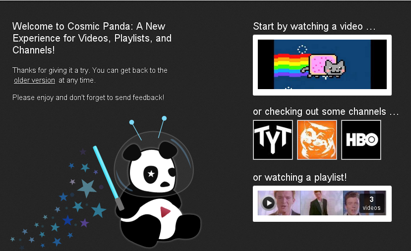
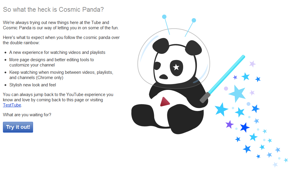
A great change for YouTube, you can read about these features on Googles support fourms. You can also opt in yourself if you want to have a good look at this new update, all you have to do is go to https://youtube.com/cosmicpanda and click Try it Out!

